BIT CLOSE
Packed Like Sardines
Brief
Build a brand identity that takes an old fashioned food
and makes it the next must-have aspirtational IT-item.
Solution
A reimagining of sardines that turns physical closeness
into a bold visual and behavioural brand system
Branding/Packaging
[THE OBSERVATION]
My curiosity about human proximity began when I overheard people on the tube talking about how a crowded commute makes them feel. This illustrated
visual identity explores how unwanted closeness can
turn into a brand world people genuinely relate to.


[DIFFERENT FLAVOURS OF AWKWARD]
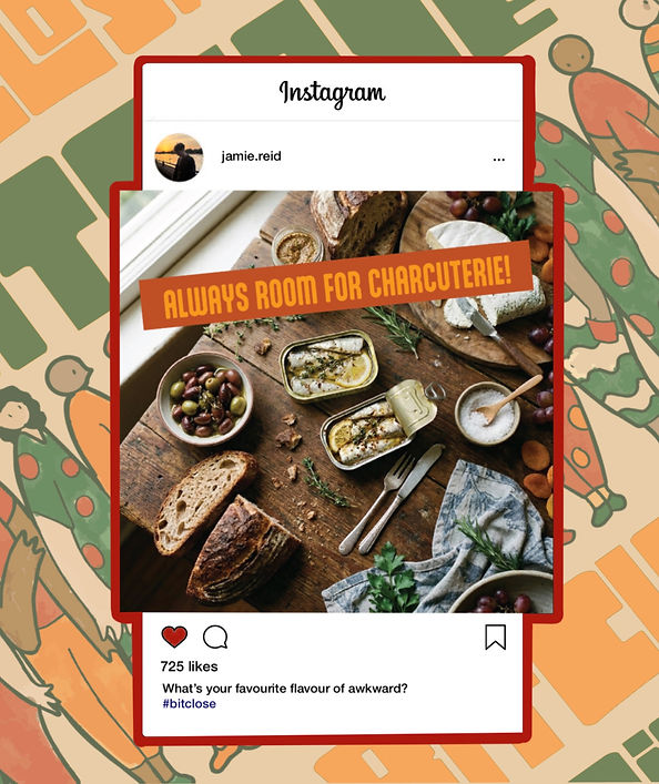
Bit Close sardines come in different flavours that represent the intensity of awkward situations. Sardines in chilli oil signify the tense nature of the morning commute, while the lemon and herb oil represents the bittersweet nature of a crowded family reuinion. Each pack features illustrations of situations like these.


[THE BRAND WORLD]
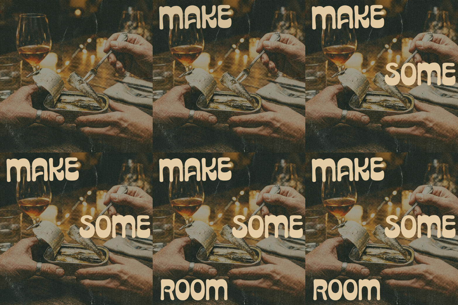
Complete with OOH advertising of Bit Close products in locations where people usually
exist in uncomfortably close proximity.